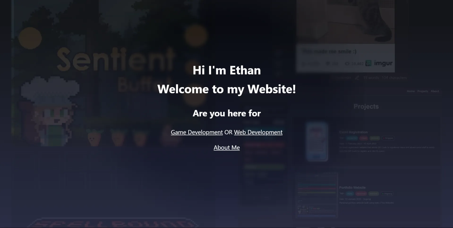
Portfolio Website build process
A small blog on how I built this website
Date: 3 March 2024 - Ongoing
Introduction
If you want to see the features the website has, there’s another blog for it. This is just showing the building process, showing my thought process.
Why I chose to build a website from scratch
- Learn HTML, CSS, JavaScript / TypeScript
- More flexibility and control
- Search functionality, making it easier for potential clients / employers to find projects related to the work they are doing
- Better performance (Especially when compared to website builders)
- My previous website for reference (Using Wix)
Why I chose Astro
- Easy to start, for a beginner in web development
- Has great markdown features, making it easy to create new project pages and update the site. Like a blog
- Fast and responsive with its islands architecture and server-side rendering
- Pre-renders most of the JavaScript on the server, making it easy to build and fast when clients view it.
- Free
- Open source
- Active community
- Frequent updates
- If you want to read more about it: Astro Docs: Why Astro
Challenges faced
Designing the website
As someone who isn’t a designer, I spent a lot of time self-studying various topics and referencing (more than the usual UI/UX designer) good and bad design decisions on other websites. This website is all of my design knowledge I’ve learnt.
Choosing Colors
My last website was very dull, with grey as it’s main color. For this website, I had to learn about Color Theory and had to make . As someone who has very little experience in art, it was all new for me. I still think the current colors can be improved, but I’m satisfied for now.
Things to improve
Better support for accessibility
Currently, many elements don’t follow user’s preference, for example, if a user has the reduced-motion preference turned on, the website doesn’t won’t adhere to them.
I could just do this. It reduces all animation duration to 0, reducing ALL motion. But I feel like it’s a bit too much as some animation is good
@media (prefers-reduced-motion: reduce) {
* {
    animation-duration: 0s !important;
    transition-duration: 0s !important;
}
Support more devices
Haven’t tested it on many devices yet, especially mobile.
Light theme
Was focusing on dark mode, haven’t tried many light mode colors. Need to make sure it works on all pages too.
More consistent styles
Currently parts of the website have slihgly different styling. For example, some parts of the website have hardcoded colors or hardcoded px/em sizes. I’ve seen some sites use CSS variables to have more consistent styling. Here are some examples.
For colors:
:root {
    /* This is already in the project */
    --color-background: #1f2247;
    --color-background-secondary: #131325;
    --color-primary: #d86372;

    /* More colors to add? */
    --color-border: #000;
    --color-border-subtle: #222;
}
For sizing
:root {
    --size-xs: 4px;
    --size-s: 8px;
    --size-m: 12px;
    --size-l: 16px;
    --size-xl: 24px;
}
Contact form
Gives others an easy way to contact me
